Codex is best in class at a lot of things, but designing a good UX/UI ain’t one of them. Claude Code however is great at UX/UI design, but lacks some of the other skills that Codex excels in. So I decided to test that feeling.
As I wrote yesterday I am not a designer, but I like to critique designs anyway. So let’s have an experiment that compares both tools in the design department head to head, to see if my feeling is right.
The briefing was simple and based on a well known MacOS app: Reminders.
Redesign the MacOS Reminders app to significantly improve usability, clarity, and speed.
Constraints:
Keep the core functionality intact Do not add new major features Focus on interaction design, layout, and visual hierarchy Assume a desktop app (MacOS style) Output:
2 Key MacOS screens Show the Interaction improvements Constraint: “Design for a user with 2 minutes per day”
Then Codex and Claude Code started the process both in a separate folder with exactly the same prompt.
The first observation I had was that Codex took longer to run: ~17 minutes, vs. ~12 minutes it took Claude Code to do the same thing.
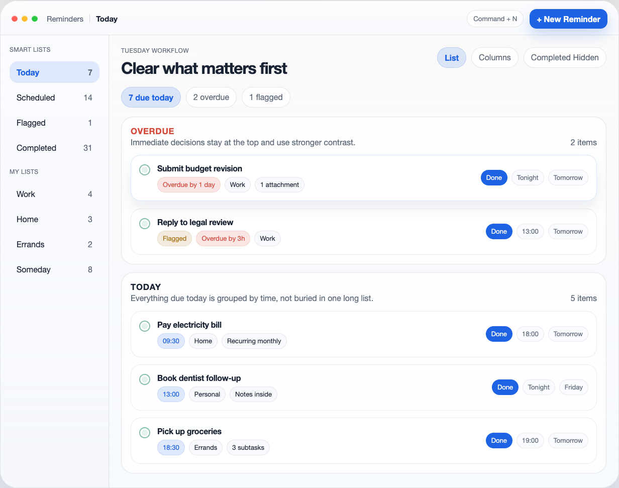
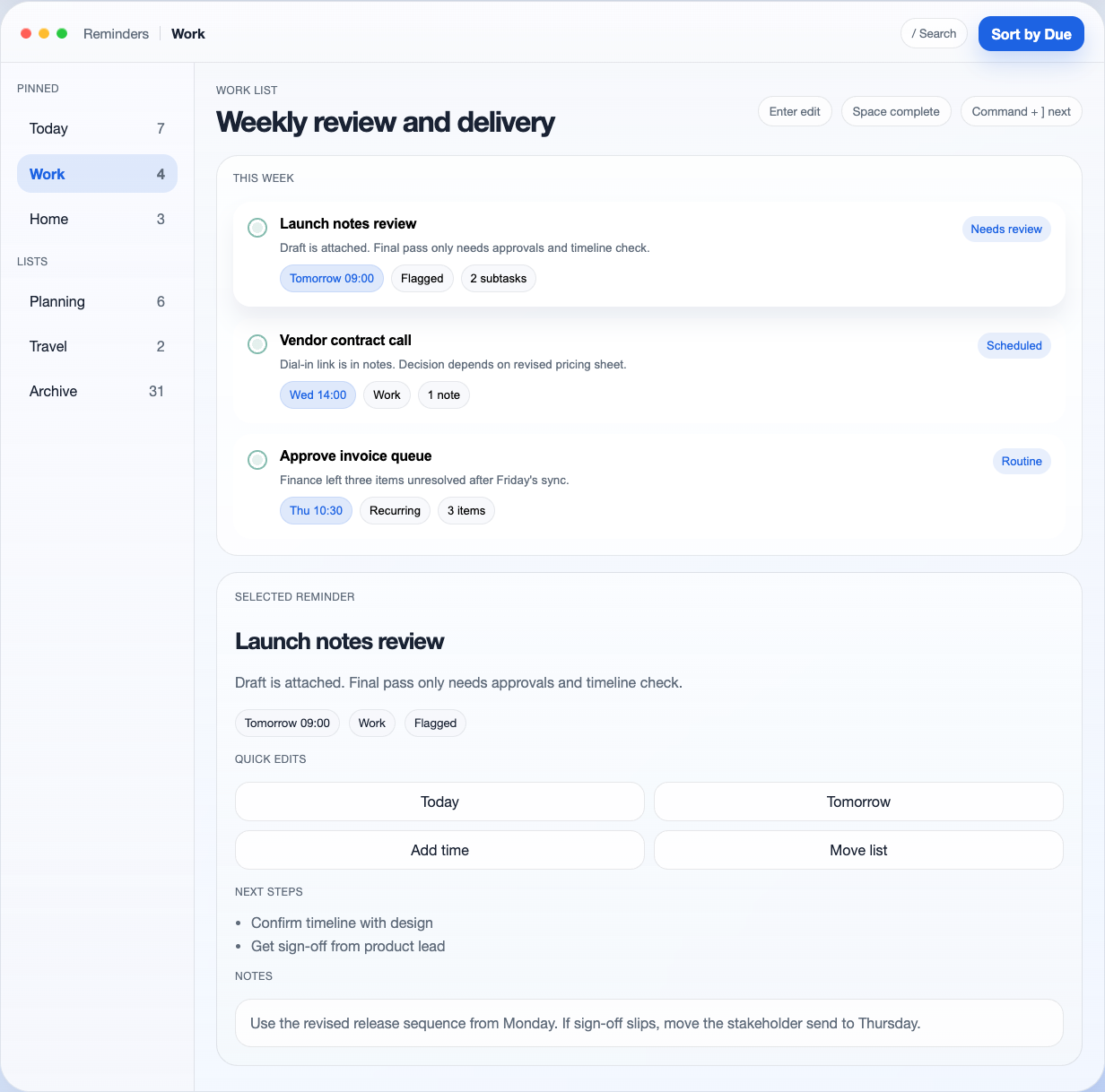
Here are the designs of Codex:
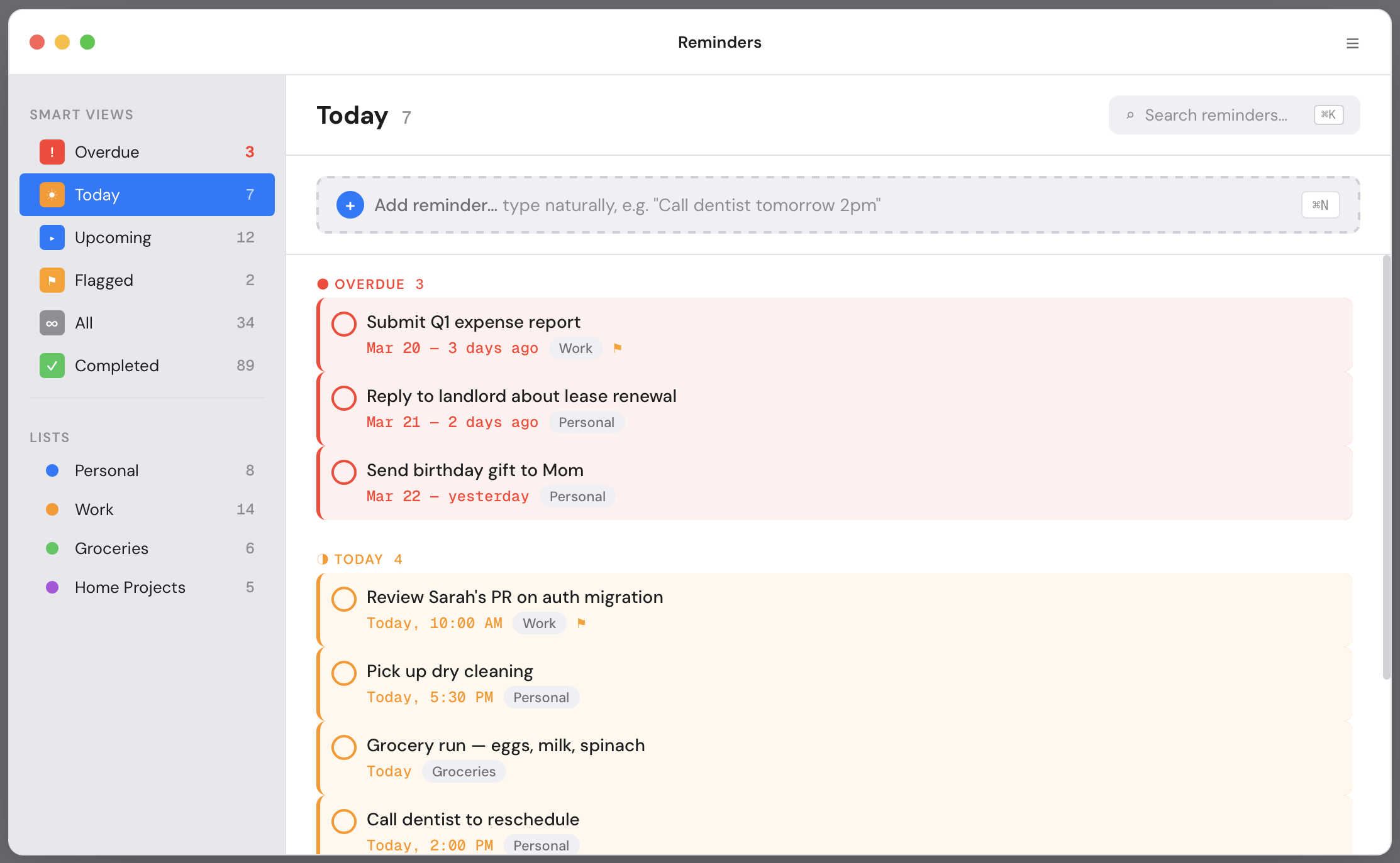
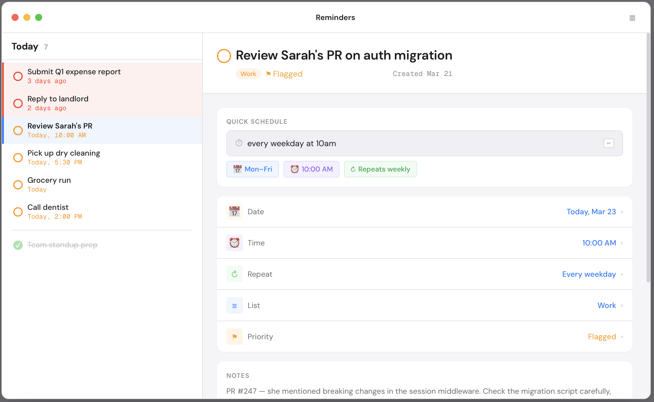
And the designs that Claude came up with:
At first glance I strongly preferred the version Codex came up with though, as it had more spacing and vibrant colors. It felt similar to the widely acclaimed Things 3 MacOS app… That was a surprise!
The Claude design felt like we were back in 2014. Just boring to be honest. The small type, dense layout, and flat colors made it feel dated.
Of course the version Codex made was not perfect, as it had some alignment issues for example that felt weird. But overall I was impressed in this head-to-head comparison.
Then let’s compare the UX improvements they both did to the design of the first screen. This was Codex explaining what it did:
FILTER CHIPS BECOME THE OPENING MOVE Overdue, due today, and flagged counts are direct filters, so the user starts with one decision instead of scanning the whole app.
URGENCY HAS VISUAL WEIGHT Overdue reminders get stronger color, more spacing, and a dedicated section above regular today items.
FINISH OR DEFER WITHOUT OPENING A SHEET Inline actions expose the highest-frequency outcomes: done, tonight, tomorrow.
EACH ROW CARRIES ENOUGH CONTEXT List, timing, and progress stay readable in one line, reducing back-and-forth into detail views.
And then Claude explained its rationale:
Urgency-tiered grouping Tasks auto-sort into Overdue → Today → Done. Overdue items get a red left border and tinted background — impossible to ignore. Today’s items get amber. No more scanning a flat list to figure out what’s on fire. Before: Flat list, manual priority After: Auto-grouped by temporal urgency
Natural language quick-add, always visible The input is always on screen — no “+” → modal → form flow. Type “Call dentist tomorrow 2pm” and it parses date, time, and list automatically. One action instead of five. ⌘N focuses it from anywhere. Before: + button → modal → 3 fields After: Type and press Enter
Overdue gets its own Smart View The sidebar now has an explicit “Overdue” smart list with a red count. Current Reminders buries overdue items inside “Today” with no visual distinction — making it trivially easy to miss 3-day-old tasks.
Keyboard shortcuts visible inline ⌘K for search and ⌘N for new reminder are shown right where you’d use them. No memorization required. Power users get speed; new users discover shortcuts organically.
Drag handles for reschedule Hover reveals a drag handle on each task. Drag between urgency groups to reschedule (drag an overdue task into “Today” to snooze it). Faster than right-click → edit → change date → save.
So they both were clear in explaining what they did. But I liked the responses of Claude Code slightly better. I liked the “keyboard shortcuts” and the “natural language quick-add” suggestions better.
Things 3 Inspiration?
As said before something that caught my eye is that the design Codex made looked vaguely similar to the Things 3 MacOS app. It mimicked the generous white space and sidebar translucency for example. I then remembered I had an experiment previously that specifically asked for a Things 3 like MacOS app design: my Relate CRM.
Could Codex have remembered that I already like Things 3 style aesthetics from that previous experiment?
Looking back into it however I saw I used Claude for that experiment instead. So this could not be the case. I would even go a bit further and was disappointed that Claude did not do better because it knew I liked the Things 3 style. Is this because the memory is separated in between each chat with Claude? I am not sure…
It’s easy to explain why Codex had a Things vibe feeling though. Because when prompted for a “High-quality macOS redesign,” Codex doesn’t reinvent the wheel. It leans into its training data. And Things 3 is widely discussed in blogs and UI examples as the gold standard for Apple look & feel, so Codex is treating it as the default for a MacOS app.
Key Insight:
Design isn’t just one thing. The experiment proved this accidentally by exposing that for the UI Codex was clearly better, but for the UX suggestions I preferred Claude slightly. So my preferred choice is Codex now as it fits my needs better. The visual polish matters most to me.